Example HDX-MS data analysis
example.Rmd1 Introduction
This document summarizes functions of HaDeX2 web server by describing example data analysis. The example dataset we will use here is part of a previously published dataset on the SecA ATPase protein (Krishnamurthy et al. 2021). SecA is an essential part of the bacterial Sec protein secretion system where it interacts with secretory client proteins as well as its associated cytoplasmic chaperones and is ultimately targeted to the SecYEG membrane channel where it interacts with both non-folded clients as well as the export channel, thereby regulating or powering protein export.
SecA is a DEAD motor domain ATPase, and in the cytoplasm the protein predominantly exists as a dimeric, ADP bound ‘quiescent’ state. Only through a series of interactions with the translocate and secretory clients does SecA become fully activated and reaches the actively ATP hydrolysing monomeric state, functioning as a molecular motor, driving protein translocation.
2 Data analysis with HaDeX2
In the next sections we will take the SecA example data and stepwise run it though the analysis pipeline of the HaDeX2 web server. In this example we focus on SecA in its dimeric state, and we compare how binding to ADP, switching the protein to its quiescent state, affects the structural dynamics of SecA.
2.1 Input Data
The first step in our HDX-MS data analysis is to upload the data. In the HaDeX2 webserver, in the ‘Input data’ tab, we can upload the data as DynamX 3.0 ‘cluster’ files. Click ‘Browse’ to select the example data file inst/HaDeX/data/SecA_cluster_wt_ADP.csv, after which the ‘File status’ should report the file is valid and is of the DynamX3.0 format.
For this dataset, we also have a structure file available, inst/HaDeX/data/SecA_monomer.pdb (modified from RCSB PDB entry 2VDA), and it can be uploaded below in a similar fashion.
Next, we set the parameters for the analysis of this data. We select the correct protein (‘Accession’), then choose which peptides correspond to the Maximal exchange control (Accession | Full Deuteration control | 0.167). The No deuterated time point is set to 0.
2.2 Deuterium uptake
We can start by looking at deuterium uptake per peptide/time point. The first plot generated is the Deuterium uptake plot (Figure 2.1). This shows replicate-averaged deuterium uptake values per peptide, for all selected states, at a given time point. It provides a good starting point to inspect the data, and verify no peptide deuterium uptake exceeds the maximal uptake control uptake.
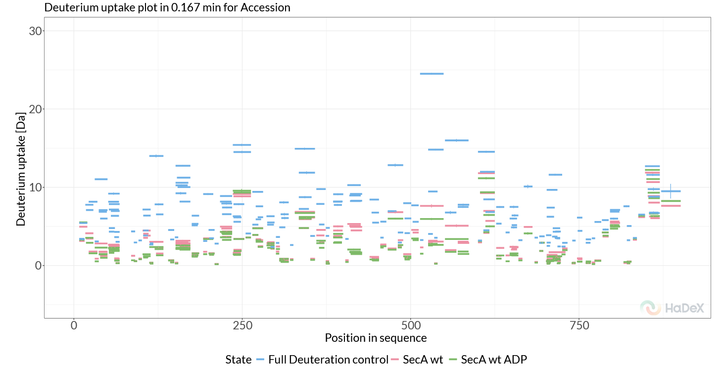
Figure 2.1: Deuterium uptake plot.
The second plot on this page is the Woods plot. This plot shows the deuterium uptake difference between two selected states, in our case this is a comparison between SecA dimer WT and SecA dimer + ADP. From the generated figure (Figure 2.2, we can immediately see that two regions stand out, both part of the SecA nucleotide-binding cleft, the first around 102-114 (Helicase motif I, NBD1) and the second at 410-428 (NBD linker region). Deuterium uptake differences in these regions are positive (red), indicating that these regions rigidify upon ADP binding, and this rigidification allosterically propagates to SecA’s client-binding clamp, thereby regulating its client interactions and activity.
If we want to inspect these regions in more detail, we can use the ‘Ranges’ section in the sidebar to zoom the x range to the regions of interest.
Next, to explore the data further, we can switch the plot to ‘Fractional uptake’, where we use the maximal exchange control as reference. Select the checkbox ‘Calculation > Fractional values’ and then at ‘time points’ make sure to select ‘chosen control’ for ‘Deut 100% Exposure’. With these settings the Woods plot shows the differential HDX data in terms of fractional deuterium uptake differences, removing the bias of peptide length. Again, we see the same two regions stand out, and if we explore more time points (‘time points > Measurement Exposure > 2’), we find additional peptides which show rigidification, such as 570-587 (motif VI, NBD2) and 630-645 (scaffold domain).
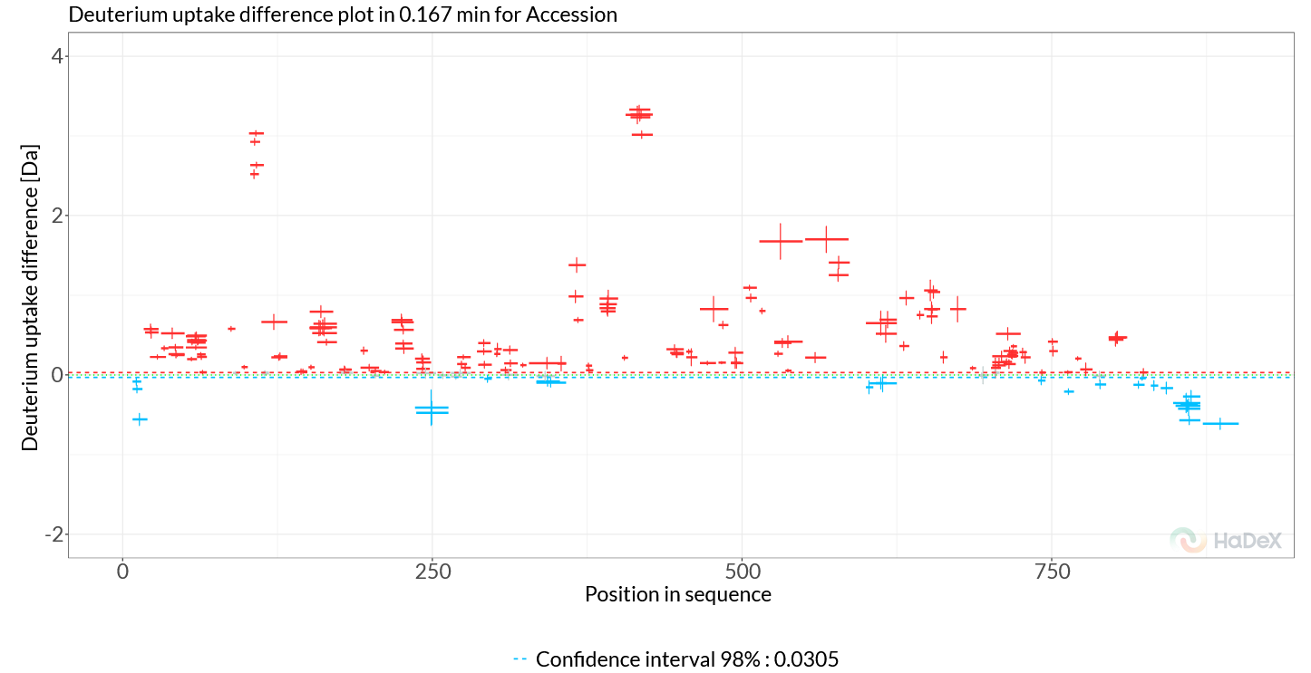
Figure 2.2: Woods plot
The ‘Butterfly Differential plot’ provides a more comprehensive view of all time points simultaneously. Switching to this view, we can more easily track the evolution of deuterium uptake differences over time and therefore all four regions of interest are clearly visible (Figure 2.3). This view reviews another potentially rigidified region, showing only at later timepoints, around the region 772-782.
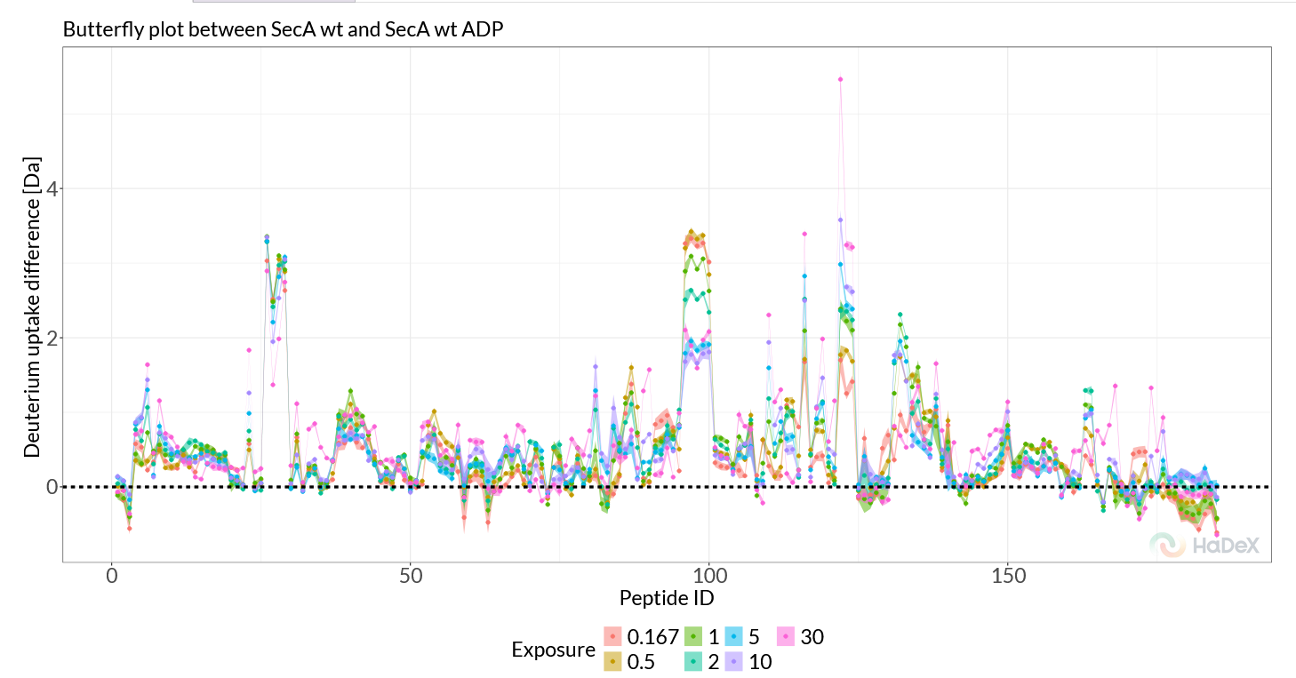
Figure 2.3: Butterfly Differential plot.
The ‘Chiclet Plot’ provides a direct overview of the time-evolution of differentially exchanged regions. Switching the plot to ‘Fractional Values’, we can see that two regions (102-114, 410-428) are present independent of the time point, while the differences in 570-587 increase over time, and the 630-645 regions shows a ‘appear-disappear’ behavior, being most prominent at intermediate time points (Figure 2.4).
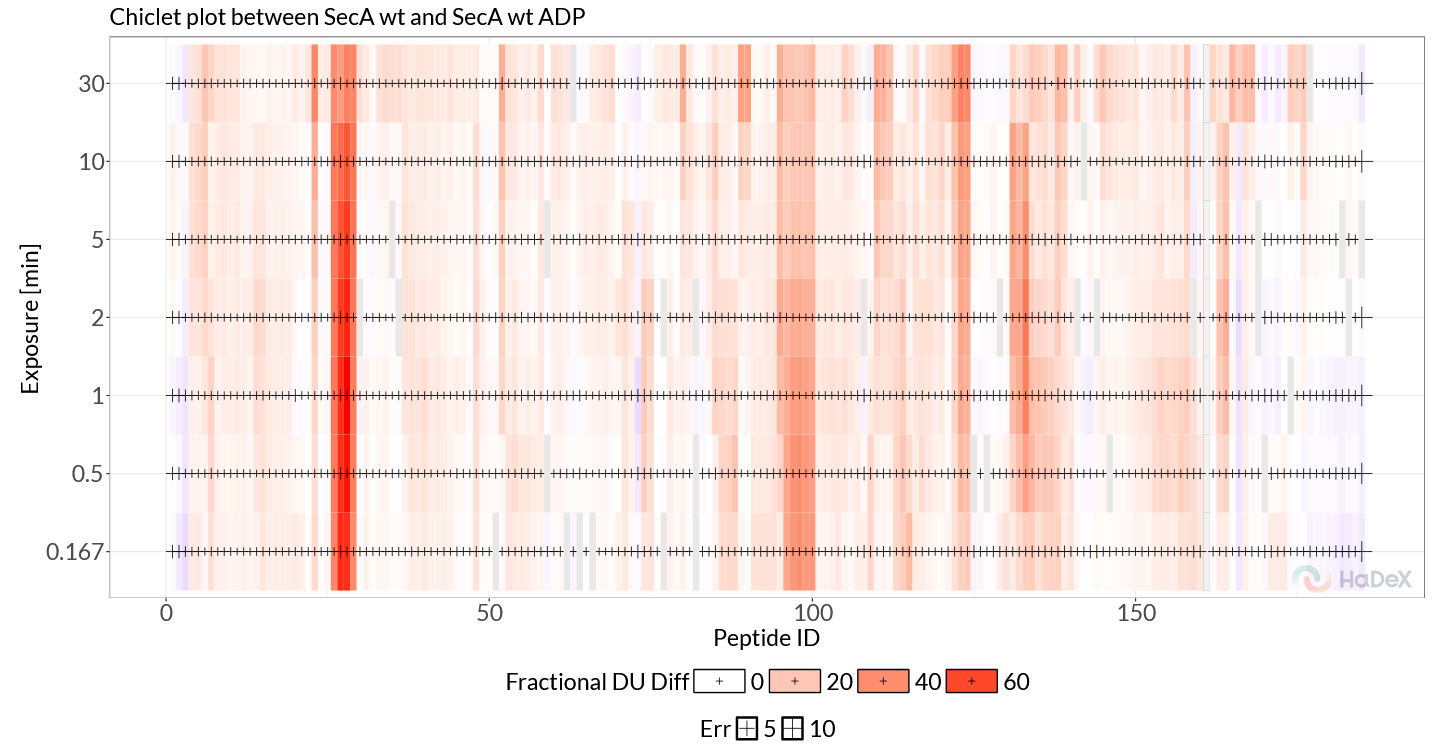
Figure 2.4: Chiclet Plot.
To zoom in on this phenomenon, we can view the uptake curve of a single peptide using the ‘Uptake Curves Plot / Differential Plot’. A single peptide can be selected in the “Peptide” section of the sidebar. Filter for sequence ‘AIANAQRKVE’, and choose this particular peptide from the filtered table. Now, we can confirm that indeed for this peptide, SecA WT initially takes up deuterium faster compared to SecA bound to ADP, but at later time points the curves converge. The ‘Differential Plot’ directly shows the differences as a rise and decay.
2.3 Time-based data
The ‘Time-based data’ tab provides more information on replicates and statistical significance between states. The ‘Replicates’ view gives a quick overview of the replicates for each state and time point. For example, the second plot on this page shows directly that for the non-deuterated control (0s), there are a couple of peptides where one or more replicates are missing. We can use this information to quickly identify peptides which might need to be excluded or we need to collect additional data. The Manhattan plot provides similar information the Woods plot, but instead of reporting on deuterium uptake differences, it shows the statistical significance of these differences. This can be an important tool when judging how to interpret deuterium uptake differences between peptides. In our example data, the Manhattan plot shows that generally we have obtained a lot of peptide with statistically significant differences, where regions with low or no differences in D-uptake also show low statistical significance. Finally, in the uncertainty plot we can see the calculated standard error of the mean for the replicates to indicate regions of higher measurement uncertainty for optional double-check, part of quality control.
2.4 Hi-res + 3D
Because we have provided a structural model alongside our peptide data, HaDeX2 allows us to directly visualize residue-level data mapped onto the structure. To achieve this, we can use ‘Differential Heatmap + 3D Vis’. Again, we use ‘Fractional values’, and set ‘Deut 100% Exposure’ to ‘chosen control’. The generated heatmap (Figure 2.5) shows the same regions of interest, with as critical difference that now instead of looking at peptide-level, the data has been mapped to individual residues by weighted averaging.
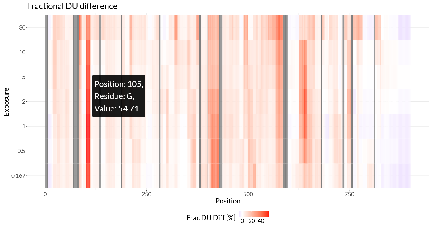
Figure 2.5: Differential hcheatmap.
In the differential heatmap, we can now see our regions of interest with residue-level resolution. The two main regions, 102-114 and 410-428, are clearly visible, as well as the more subtle differences in 570-587 and 630-645. The region around 772-782 is less clear in this view, likely because this region is only subtly affected and only at later time points.
The 3D viewer provides an interactive way to explore these differences in the context of the protein structure. By mapping the differential HDX data onto the 3D structure of SecA, we can directly see how ADP binding rigidifies specific regions of the protein (Figure 2.6). In this figure, we can clearly see the strongest response in helicase motif I, rigidifying upon ADP binding, as well as the allosteric propagation of this effect through the scaffold regions ultimately resulting in a long-range allosteric response in the client-binding PPD domain.
For more control over the visualization colors and plot ranges, the residue-level data can be exported in a .csv format and subsequently visualized by HDX-Viewer (Bouyssié et al. 2019). When exporting the data to HDX-Viewer, click the ‘Export data for HDXViewer’ and follow the steps described in the popup window.
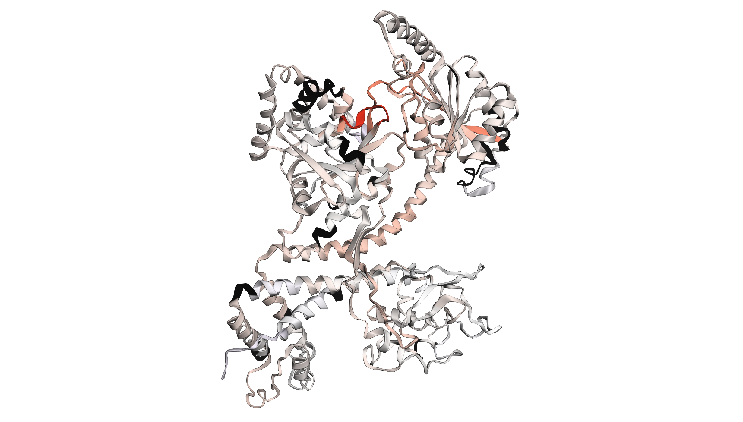
Figure 2.6: 3D view of differential HDX data on the structure of SecA.
2.5 Measurements
The ‘Measurements’ tab allows us to further inspect the individual replicate measurement results. This tab provides a per-peptide view where we can use the peptide table in the sidebar to select peptides of interest. Then, for the selected exposure time, we can now inspect each replicate measurement, see how they are distributed and we see which charged states were used and how they compare. The second graphs shows this information for all time points as a peptide uptake curve.
2.6 Sequence data
The ‘Sequence data’ tab can be used to reconstruct the sequence from the uploaded data and shows the coverage and sequence length. This can be used as a quick sanity check to confirm the correct sequence information was used. This tab also provides peptide coverage plots. The ‘Coverage’ graph (Figure 2.7) gives a quick overview of which peptides were identified, and which regions have no coverage. The ‘Position Frequency’ graph on this page shows for each residue how many peptides cover this region, providing information on peptide redundancy.
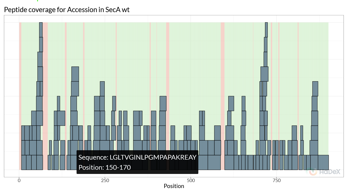
Figure 2.7: Peptide coverage for SecA WT.
2.7 Summary
The summary is a very convenient and quick way to generate a summary report of the uploaded data, according to community recommendations (Masson et al. 2019). The report can be exported in a variety of tabular formats.